Technology-Led Rally Drives Markets Higher Amid Inflation Concerns

Market Recap for the Week of May 4, 2026
The U.S. stock market continued its strong upward momentum this past week, led primarily by the Technology sector, which gained more than 8% over the course of the week. The broader S&P 500 advanced nearly 2.5% during the same period. Meanwhile, Energy stocks, despite remaining the top-performing sector year-to-date, declined just over 5% for the week.
In a notable reversal, the Technology sector has gone from being the worst-performing sector just over a month ago to now ranking as the second-best performer year-to-date. Several technology companies have played a major role in the recent rally, including Intel, Micron, Western Digital, and Seagate, all of which have gained more than 100% year-to-date.
Oil prices remain elevated, with crude closing the week at $95 per barrel. Despite higher energy prices, markets appear to be focusing on the strength of the current earnings season as justification for continued gains in equities. The 10-year Treasury yield has also moved modestly higher year-to-date and currently sits at 4.36%. Persistent inflation concerns have likely prevented the 10-year yield from falling below the 4.00% level. Investors will receive another inflation reading this coming Tuesday, which is expected to remain elevated given the recent increase in oil prices.
“The market’s recent rally highlights how quickly leadership can shift, as Technology moved from the worst-performing to one of the year’s strongest sectors in just weeks.”
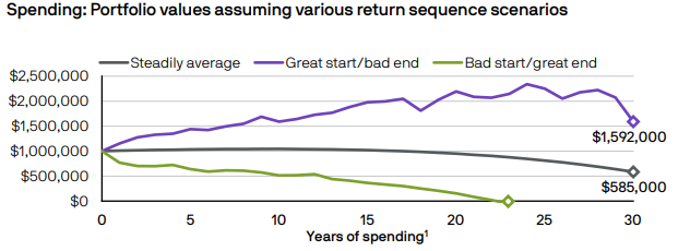
Chart of The Week
This week’s chart, sourced from the JPMorgan Guide to Retirement, highlights the impact of sequence-of-returns risk in retirement planning.
The chart compares three hypothetical investors, each starting retirement with a $1,000,000 portfolio and withdrawing $40,000 annually, with withdrawals increasing by 2.5% per year to account for inflation. All three portfolios achieved the same average annual return of 5%; however, the timing of those returns produced dramatically different outcomes.
The purple line represents an investor who experienced stronger returns early in retirement and weaker returns later on. The green line reflects the opposite scenario, where poor returns occurred during the early years of retirement. The black line represents a portfolio earning a steady 5% annual return with no volatility.
As illustrated, the green portfolio ultimately runs out of money—not because the average return was insufficient, but because negative returns occurred early in retirement while withdrawals were already being taken. This demonstrates why a well-structured withdrawal strategy and thoughtful asset allocation are critical components of retirement planning.
Please feel free to reach out if you would like to discuss these concepts in greater detail.
The commentary in this blog is for informational purposes only and should not be taken as personalized investment advice
Source: J.P. Morgan Asset Management. Hypothetical return scenarios are for illustrative purposes only and are not meant to represent an actual asset allocation.